Preference Test: Filter Functionality of “Body by Blogilates” app.
Description of the app
The Body App by Blogilates has an entire workout video library (full-length videos); besides, it has no ads, and it is 100% free to download. There are hundreds of workouts focused on abs, arms, back, butt, cardio, legs, stretch and total body. However, the most important feature is the interactive “Workout Calendar”, which is a monthly-exercise plan designed to help the user to get lean, toned, and strong at home by using the Blogilates (Pilates) workout videos. Also, the user will be able to do the featured challenge of the month.
Experience that needs improvement
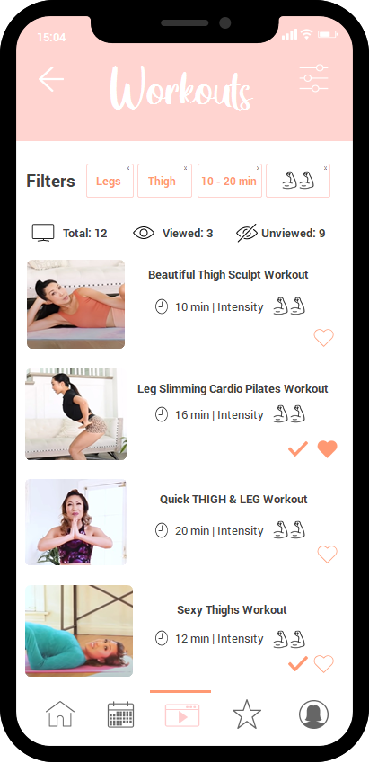
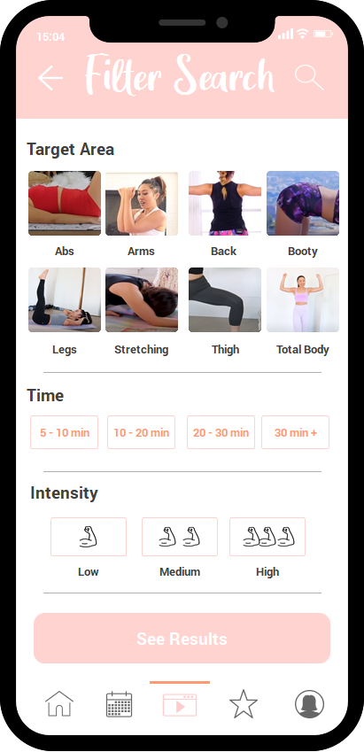
Due to the workout video library’s size, which is huge, the person must use the app’s filter to find the desired video more easily. However, I think the filter function of this app does not make the search easier because it has only two filters (video time and workout intensity). For this reason, a new and better filter design was made to include more filter options and to improve the search for workout videos.
The goal is for participants to be able to choose the best design for the filter function.
Study design
This was a within-subjects (or repeated-measures) study design, which means that the same person tests all the conditions (i.e., all the user interfaces). In this survey, each participant could see both filter functions. It wanted to measure which of the two apps (designs), A or B, is better; it could choose design (with two possible values or levels — A and B) as the independent variable, and the accuracy for the filter could be the dependent variable.
A 16-question survey was conducted, which was divided into:
Questions about demography: There were a total of 4 questions to understand who the participants were. The questions were about age, gender, residence address, and current employment status.
Questions about experience with fitness/workout apps: There were 4 questions to find out about the experience with other fitness/workout apps and their filters. The questions were about time spent on their workout app, if the workout app has a filter function, time spent using the filter function, and if it is easy to use the filter section on their workout app.
Questions about design A: There were 3 questions about design A. The questions were about if it would be difficult to use the filter, if it is suitable or unsuitable, and if the user felt satisfied or unsatisfied using the filter.
Questions about design B: There were 3 questions about design B. The questions were about if it would be difficult to use the filter, if it is suitable or unsuitable, and if the user felt satisfied or unsatisfied using the filter.
Questions about the preference regarding both designs: There were 2 questions about which design was easier to use, and which one was preferred by the user.
The designs were:
Design A was the original design of the app's filter function.

Design B was a new design of the filter function. It was a prototype.
The survey was conducted in Google Forms because it is a platform that enables to ask survey questions and include visual elements. In this case, the original app design and a wireframe were shown. The objective of the survey was to know the user’s perception about both filters’ designs. The survey was approximately 15-minute long.
Subjects
This survey had a sample of 20 participants. To participate in the survey, they were asked to have experience using fitness/workouts apps. This was a requirement because the participant could get an idea of how a workouts app looks like and how to navigate on it. Also, most workout apps have a filter function. So, it is easier for the participant to choose between the two filter designs based on their experience.
Participants had to be over 18 years of age to avoid possible biases on the survey; for example, to avoid unanswered questions or meaningless answers. However, this does not ensure that the survey does not have bias at all.
Results
All participants live in Central America. The study had 21 participants, 47.6% were between 29-39 years old, and 42.9% were 18 to 28 years old. This information could reflect that most workout apps’ users are young adults, so a strategy should be designed to attract older audiences; for example, to expand the offer with more workout videos specifically designed for that population. Older users need to identify with the people from the video and feel comfortable doing exercises from the app. In addition, the app could be improved by offering users a design that can be easily used by all ages.
61.9% of the participants were women and 38.1% were men. This could also reflect that male users should be more encouraged to exercise at home using the app. Therefore, a strategy should also be designed to attract the attention of men. 33.3% of the participants had a full-time job (more than 40 hours a week), 28.6% were students and 23.8% had a part-time job. This information reflects that users who work or study use workouts apps. It is very likely that these users are more comfortable exercising from home, due to their occupation and responsibilities. However, only 9.5% of the unemployed people use an exercise app, so it would be necessary to investigate further why this happens. One reason for this could be that many exercise apps require a paid subscription to access the videos or other activities (such as recipes, personal trainer, statistics, etc.), so a deeper research is needed.
The time that people use the app was approximately 30 minutes to 1 hour (38.1%); there were also several users who use the app between 1 hour to 2 hours. This result means that users use the workout app a lot, so it is important to give them the best possible design for a better user experience.
57.1% of the participants reported that the workout app they currently use had a filter option. This reflects that the filter function is necessary for this type of apps. In addition, 55% of the participants said they used the filter function a couple of times, and 40% of them said that the filter function is somewhat easy to find in their workout applications. This means that the filter function is widely used among users, so this function must be well designed to satisfy the users’ interest.
Regarding design A (original design), 47.6% of the participants said that it is neither difficult nor easy to use the filter function. Furthermore, 50% of the participants think that the functionality of the filter in Design A is neither suitable nor unsuitable. This means that the filter function is not the most appropriate, so it could be improved both in its design and in its search. To reaffirm this, 40% of the participants think that they are not satisfied or unsatisfied with design A, so a better design could be considered.
Regarding Design B, 47.6% of the participants think that this design for the filter is very easy to use. In addition, 55% of the participants think that it is very suitable, and 61.9% said that they would be satisfied with this design. This means that design B could be the most suitable and could improve the user experience. In this new design, more filter options were provided, more visual elements were used to make it more understandable for the user. It is also easy to access and easy to select filters. This was created to be more intuitive for the user.
Lastly, 90.5% of the participants think Design B is easier to use than Design A, and 95.2% said they would prefer to have Design B as filter function. Therefore, Design B was the most suitable choice voted by the participants, so it would be a good option to improve the filter function in the “Body by Blogilates” app.
Filter Function Prototype